- Garmin produces the most consistent data – it shows the longest average sleep duration, the lowest variability, and very low outlier rates, making it the most reliable for long-term trend tracking.
- Apple consistently underestimates deep sleep and shows the most data quality issues – including missing sleep stage classifications, unusually high outlier rates, and even impossible values, suggesting its sleep staging is less reliable.
- Oura and Fitbit add valuable nap detection but increase variability – Oura, in particular, records many short sleep episodes, which lower the average sleep time until they’re filtered out. Fitbit is cleaner overall, striking a balance between accurate nap detection and stable results.
Sleep Tracking
Benchmarking Wearable Sleep Data Reliability
We analyzed sleep data from over 5,000 real-world nights across Apple Watch, Fitbit, and Garmin users. Garmin delivered the longest, most consistent sleep duration with the lowest variability and almost no outliers, while Apple consistently under-reported deep sleep and showed the highest error rates. The results reveal clear winners and losers in wearable sleep-tracking accuracy — and why device choice matters for long-term trends.
November 28, 2025
Key takeaways
Interested in your sleep? How accurate is your wearable sleep data?
Sleep is one of the most fundamental processes for recovery, health, and performance. When people ask me about the newest recovery tool, I like to quip, “It may help, but nothing makes up for bad sleep. Recovery is 90% sleep, 9% nutrition and everything else makes up the rest.” This may be a slightly facetious exaggeration, but it’s not too far from the truth. As more of us turn to wearables each night to track our rest, it’s natural to wonder just how consistent these devices are. We analysed data from thousands of users—2,581 from Oura, 1,086 from Apple, 620 from Fitbit, and 669 from Garmin. While we can’t be entirely sure that each device’s users are similar (each device sample is representative of the broader population), the data is drawn from two similar platforms. On the other hand, for example, Garmin users could be more serious athletes than Apple users and thus might sleep more!
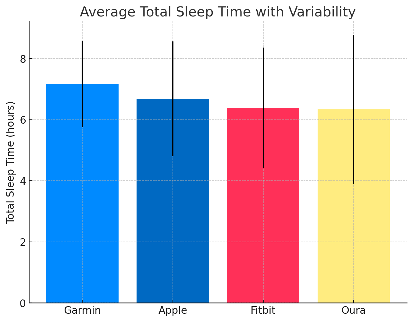
Total Sleep Time: Who Gives You the Longest Night?
When it comes to total sleep time, Garmin users are the most well-rested. On average, Garmin recorded 7.17 hours of nightly sleep, the highest among the four platforms. Oura users, by contrast, clocked just 6.34 hours, the lowest of the group. Apple and Fitbit fell in the middle at 6.68 and 6.39 hours, respectively.
The range of recorded values tells a different story. Apple data showed astonishing variability, with some nights apparently lasting over 51 hours—clearly impossible. Garmin, by contrast, had the tightest spread and the lowest standard deviation. In plain terms, Garmin’s numbers were the most consistent, while Apple’s showed a greater tendency towards extremes. Fitbit and Oura sat between these two poles, although Oura’s inclusion of naps and multiple events per day further inflated variability.
Get the latest Terra Research reports and insights every week as soon as they're published.
By continuing, I agree to the Privacy Policy and Terms of Service.

The Composition of Sleep: REM, Light, and Deep
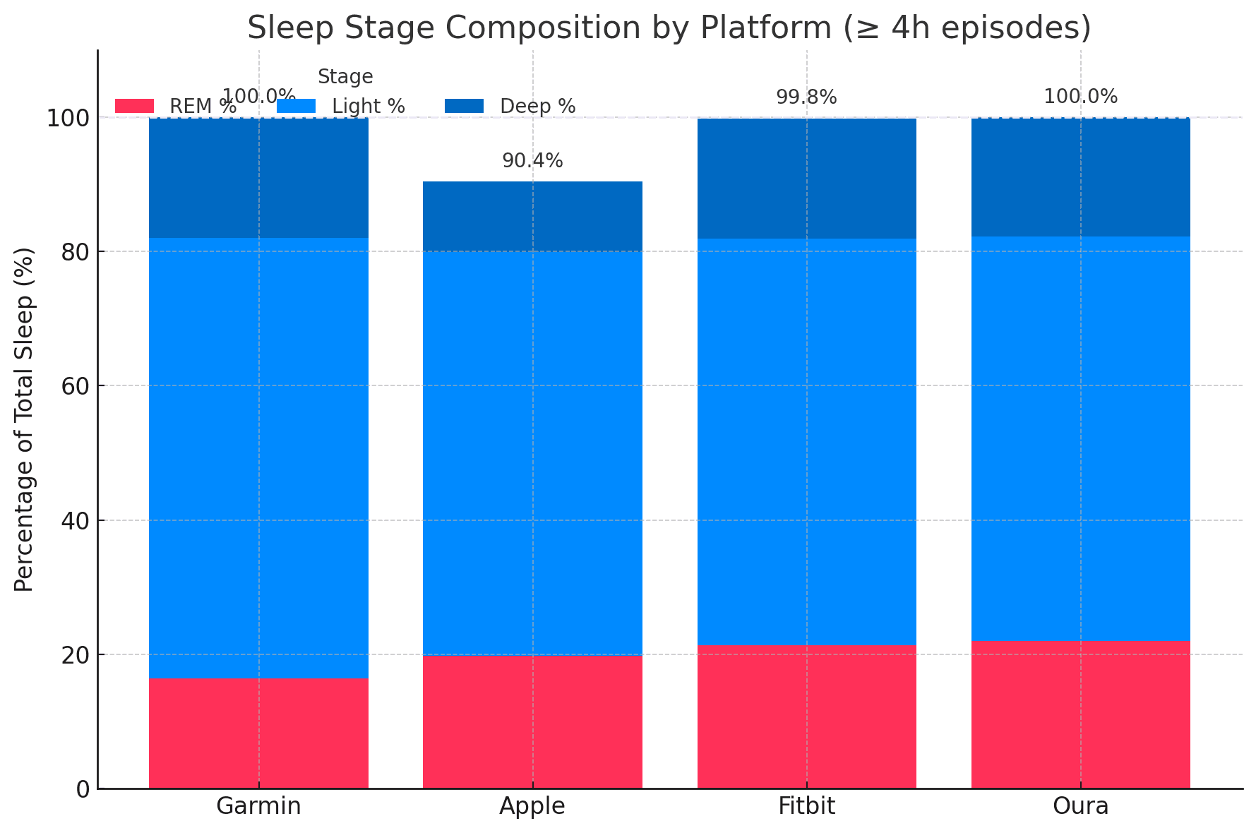
Beyond duration, wearables also attempt to break sleep into stages. REM sleep, the stage linked to dreaming and memory consolidation, was consistent across platforms, ranging from 16.4% (Garmin) to 21.4% (Fitbit) of total sleep time. Light sleep dominated across the board, accounting for around 60–66% of the night. Deep sleep, associated with recovery and growth, revealed the most striking difference. Apple recorded an average of only 10.5% deep sleep, compared with nearly 18% for Garmin, Fitbit, and Oura. This suggests Apple’s algorithms may be systematically underestimating deep sleep.
When sleep is filtered to exclude short naps (less than four hours), the percentages settle further. Garmin and Fitbit maintained a deep sleep rate of nearly 18%, Oura came in at 17.8%, while Apple remained at 10.5%. In other words, no matter how you slice it, Apple stands apart in reporting less deep sleep than other devices.
The Outlier Problem
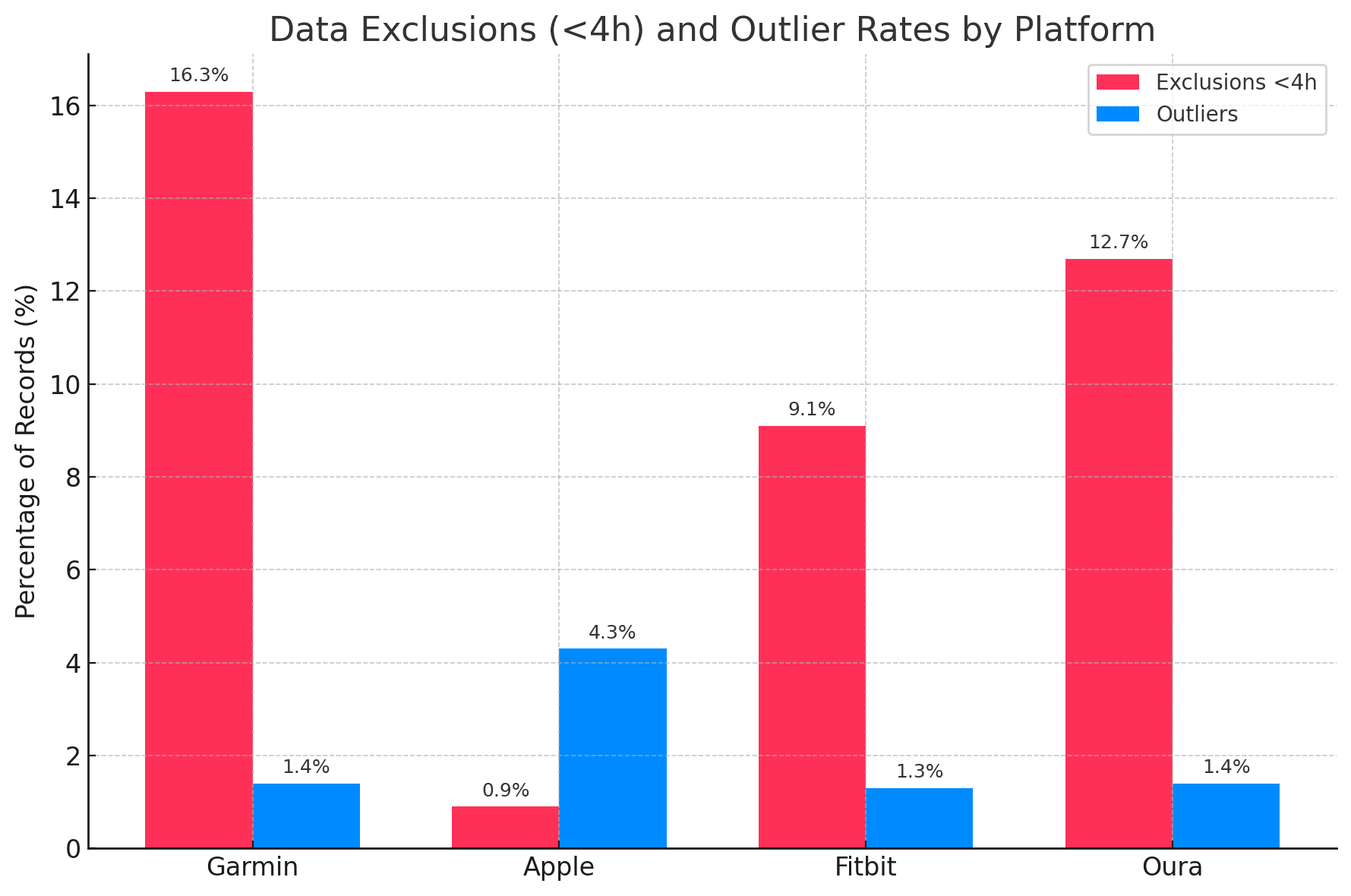
No dataset is perfect, and wearables are no exception. There is already a significant amount of smoothing that occurs during the data processing pipeline, to exclude outliers. We decided to run an outlier detection test using the standard 1.5 × IQR method to highlight how each platform handles noisy or erroneous values.
Oura initially showed the highest rate of outliers, particularly in total sleep time, where 13.3% of values fell outside the expected range. Apple, while more stable in total sleep time, produced outliers in specific sleep stages—light and REM in particular. In fact, Apple displayed the single highest outlier rate for any metric: 4.33% in light sleep. Garmin, by contrast, had the lowest overall outlier rates, with less than 1.5% across most categories. Fitbit performed similarly well, showing low and balanced outlier levels.
We decided to remove short sleeps (naps) by removing every event under 4 hours long. At this point Fitbit and Garmin emerged as the cleanest platforms. Oura improved substantially, dropping its total sleep time outliers to 1.43%, while Apple continued to struggle, particularly with stage classification. The presence of negative values in Apple’s deep sleep data even suggests measurement or synchronisation errors—something no statistical threshold can fix.
Naps and Multiple Events: The Oura Factor
Oura and Fitbit include naps in sleep data and also separately flag them in the output data. Around 12.7% of Our sleep records were classified as naps by our < 4-hour criteria, averaging just under an hour. Fitbit also identified naps, though less frequently and with a longer average duration of 1 hour and 40 minutes.
This difference has a profound effect on total sleep time. The inclusion of many short episodes can partly explain Oura’s lower average TST. When these are removed, Oura’s nightly average rises to 7.12 hours—almost identical to Garmin's. It is a reminder that how a device defines and detects sleep events can alter the statistics dramatically.
You can see for yourself (in figure 2) that Apple has almost no sleep episodes under 4 hours, pointing to the fact that they already proactively remove nap sessions from sleep data.
Clustering of Outliers
The distribution of outliers across users also varies. Oura’s outliers are widely spread, with nearly all users having at least one unusual record, but each user contributes only a small share. Garmin is the opposite: fewer users show outliers, but when they do, they are concentrated in a handful of nights. Apple and Fitbit sit between these two extremes.
This pattern matters because it reflects whether anomalies are occasional glitches across the board, or recurring issues for a subset of users. For researchers or product developers, knowing the difference can guide decisions about cleaning and interpreting data.
Cross-Platform Consistency: Where They Agree, Where They Don’t
Despite the differences, there are encouraging consistencies. All platforms converge on similar ranges for REM sleep (16–21%) and total sleep time (6.3–7.2 hours). Light sleep hovers around 60–66%, though Apple’s tendency towards variability is notable. Deep sleep is the main point of divergence, with Apple showing significantly lower values.
From a data quality perspective, Garmin is the clear winner: consistent averages, low outlier rates, and stable stage classification. Fitbit performs nearly as well, with balanced results across most metrics. Oura provides the most detailed dataset, including naps, but at the cost of higher variability and occasional data issues. Apple, while popular and widely used, shows systematic problems with stage classification and higher rates of extreme outliers.
What This Means for Users and Researchers
For the casual user, these differences may not matter much. Whether you slept 6.8 or 7.1 hours is unlikely to change your morning routine. But for researchers, athletes, and clinicians, understanding the strengths and weaknesses of each platform is vital.
- Garmin seems to be best suited for consistent, reliable long-term trends.
- Oura offers the richest data, especially for those interested in nap behaviour, but requires careful filtering.
- Fitbit strikes a balance: relatively clean data without the extremes seen in Apple.
- Apple provides broad accessibility, but it should be treated with caution when interpreting deep sleep and outlier values.
Ultimately, no wearable is perfect, and all rely on algorithms that make educated guesses based on movement, heart rate, and other signals. The real value lies in recognising patterns over time, rather than obsessing over single-night accuracy.
The next stage is to compare the distribution from each wearable with the gold standard measure, Polysomnography (PSG). That’s something to look forward to in a later blog!
Summary
- Which wearable records the longest sleep, and which records the shortest?
- Across 4,956 users, Garmin recorded the longest average nightly sleep at 7.17 hours, while Oura came in lowest at 6.34 hours. Apple and Fitbit fell in between at 6.68 and 6.39 hours respectively. Once short episodes under 4 hours are filtered out, Oura's average jumps to 7.12 hours — essentially identical to Garmin's — showing that nap inclusion drives most of that gap.
- Why does Apple report so much less deep sleep than other wearables?
- Apple averaged just 10.5% deep sleep, compared to roughly 18% for Garmin, Fitbit, and Oura — a gap that persists even after filtering naps under 4 hours. Apple's stages also fail to sum to 100%, under-reporting by about 10%, and the dataset even contains negative deep sleep values suggesting sync errors. The takeaway: Apple's algorithm stages sleep fundamentally differently, and deep sleep readings should be treated with caution.
- How much do wearables actually agree on sleep stages?
- More than you'd think. REM sleep converges across platforms at 16–21% of total sleep time, light sleep dominates at 60–66%, and total sleep time falls within a narrow 6.3–7.2 hour band. Deep sleep is the major outlier — three platforms cluster near 18%, but Apple sits alone at 10.5%.
- Which wearable has the cleanest, most reliable data?
- Garmin. It had the tightest standard deviation on total sleep time, the lowest outlier rates (under 1.5% across most categories), and stable stage classification. Fitbit was a close second with balanced, low-outlier results. For long-term trend tracking where reliability matters more than feature richness, Garmin is the strongest choice in this benchmark.
- Why does Oura show shorter sleep times than other devices?
- Because Oura logs naps and multiple sleep events per day, which drag the average down. About 12.7% of Oura records were naps under 4 hours, averaging just under an hour each. Filter those out and Oura's average climbs from 6.34 to 7.12 hours — meaning Oura isn't measuring less sleep, it's just counting more events.
- How often does my wearable record implausible sleep values?
- It depends on the platform. Before filtering, Oura flagged 13.3% of total sleep time values as statistical outliers (1.5×IQR method), and Apple hit 4.33% outliers in light sleep — the highest rate for any single metric. Apple's data even included nights apparently lasting over 51 hours. Garmin and Fitbit stayed under 1.5% across most categories, making them the most trustworthy for single-night readings.
- Are outlier nights spread across all users or concentrated in a few?
- The pattern differs sharply by platform. Oura's outliers are spread across nearly all users, with each contributing a small share — suggesting occasional glitches everywhere. Garmin shows the opposite: few users have outliers, but those who do have many concentrated bad nights. This matters for data cleaning strategy — Oura needs broad smoothing, Garmin needs user-level review.
- Should I trust my wearable's single-night sleep score?
- No — trust the trend, not the night. Every platform relies on algorithmic guesses from movement and heart rate, and all show measurable error rates, stage disagreements, and occasional impossible values. Whether you slept 6.8 or 7.1 hours rarely changes anything actionable. The real signal is in week-over-week and month-over-month patterns, not last night's deep sleep number.
Continue reading
Running
Data Shows Most Runners Don't Actually Get Faster
How do runners actually get faster? We analyzed 856,000 running activities to find out who actually gets faster. It wasn't the intense ones, but rather the consistent ones. Showing up month after month beat everything flashier. Boring, as it turns out, is fast.
May 7, 2026

Marathon Series
The Data Behind the London Marathon
While Sabastian Sawe was busy breaking the two-hour marathon barrier in London, the watches of 571 amateur runners told a quieter but equally fascinating story. GPS devices over-measured the course by 527 metres on average, faster runners ran with higher heart rates than the slower ones did, and Coros watches reported 47% more calories per kilometre than physiology actually supports.
April 27, 2026

London Data
Tube Strikes Made Londoners Active
During the April 2026 Tube strikes, Londoners adapted by cycling more—activity tripled, e-bike commutes rose 13%, and 19% of cyclists were entirely new to riding. Data analysis of 1,566 weekday rides revealed e-bike share jumped from 54.9% to 67.5%, with commutes often staying local. The strikes disrupted transit but highlighted Londoners' resilience in finding alternative ways to move.
April 24, 2026

Endurance Training
Running Is The Hardest Endurance Sport? Not so Fast
Which sport is hardest on the heart? We ran the question through hundreds of thousands of sessions across nine activity types. Running dominates minute-for-minute. It has the highest average, highest peak, highest sustained intensity. But its shorter sessions mean total cardiovascular load per outing often falls behind skiing or hiking. The shape of the heart rate curve tells a different story for every sport, and the weighting method you pick changes the answer.
April 23, 2026