We tested whether sleep wearables actually agree — analyzing 77,000+ nights across six devices, plus same-person, same-night comparisons to isolate true device differences.
Sleep duration lines up, sleep stages don’t — most trackers cluster around ~7 hours of total sleep and are usually within ~15–22 minutes on the same night, but deep/REM/light can diverge by hours between devices.
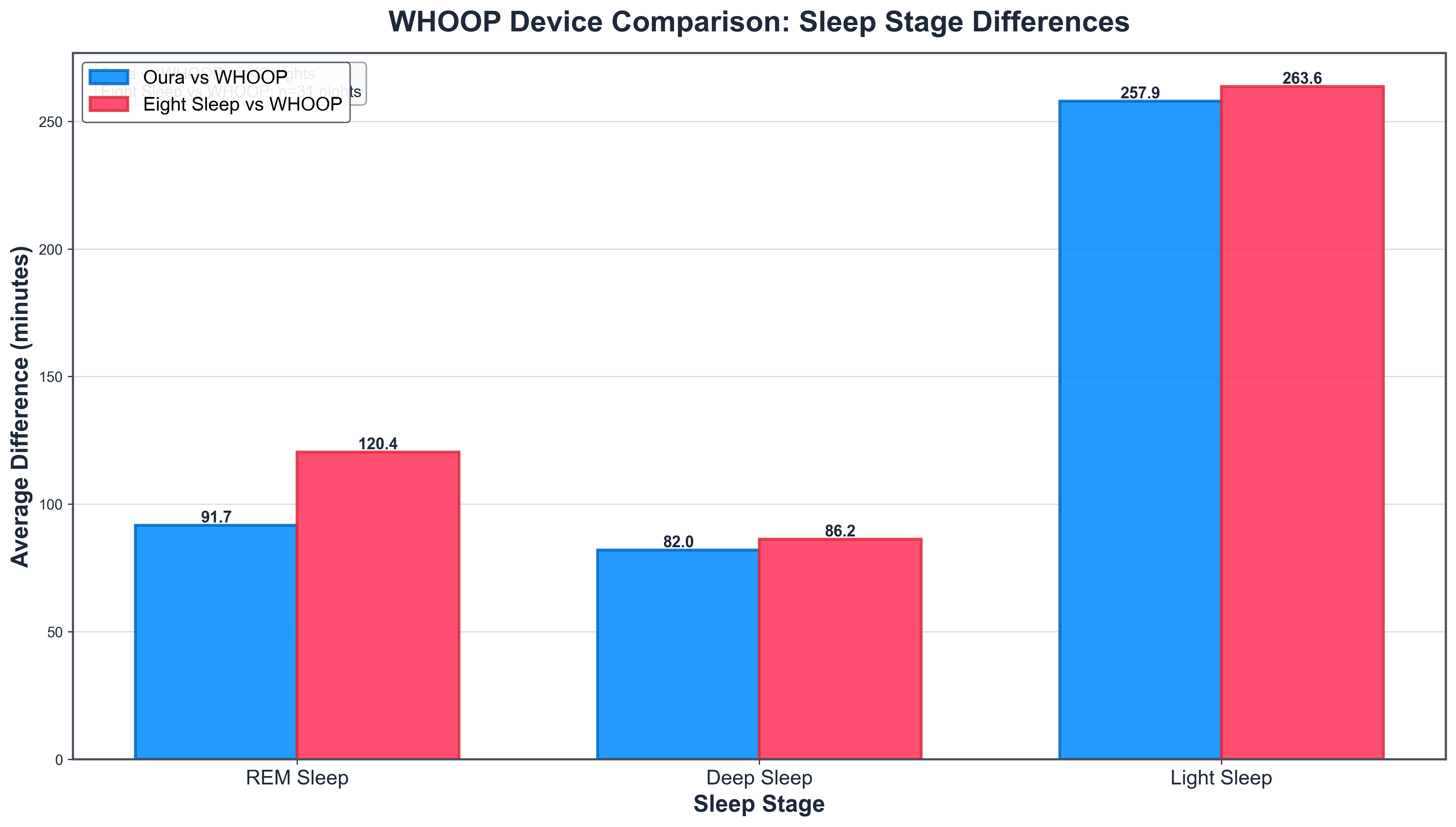
Key takeaway: sleep stages don’t match across devices — on the same nights, trackers differed by ~32 min (deep), ~23 min (REM), and ~38 min (light).
Sleep Tracking
Sleep Metric Variation Across Wearables
We analyzed sleep data from 77,000+ nights across six major wearables, then zoomed in on same-person, same-night overlaps to isolate true device differences. The headline: most trackers converge on sleep duration — averages cluster around ~7 hours and median night-to-night differences are typically ~15–22 minutes. But once you break sleep into stages, agreement falls apart: REM, deep, and light can diverge by hours in direct comparisons, highlighting how much staging depends on each company’s sensors and algorithms. The takeaway is practical: trust trends in total sleep time, treat stage minutes as directional, and avoid over-optimizing for a “perfect” score when the underlying measurements don’t match.
Alistair BrownleeHead of Research
Faraaz AkhtarAI and Health Researcher
Halvard RamstadEditor-in-Chief
January 22, 2026
Key takeaways
WHOOP Data and Direct Multi-Device Comparisons
After we published the sleep data comparison a few weeks ago, we had quite a lot of requests on social media from WHOOP users eager to see how their device stacks up. So we're excited to include WHOOP in this updated analysis.
Building on our previous population-level exploration of sleep data from a range of wearable devices, we incorporate fresh insights from direct head-to-head comparisons—nights where the same individuals used multiple devices simultaneously.
The dataset spans November 17 to December 17, 2025, encompassing over 77,000 filtered main sleep episodes (excluding naps and durations outside 4-13 hours). This real-world aggregation from thousands of users offers a robust view of consumer sleep patterns and device performance.
The Crucial Distinction: Population-Level vs. Direct Comparisons
A core limitation of population-level analyses, such as our earlier one, is that they compare averages across different user groups. For instance, if Eight Sleep users average longer sleep than Apple Watch users, is that because the smart bed's temperature regulation genuinely extends sleep duration, or because Eight Sleep attracts a demographic more committed to recovery (e.g., biohackers or those with sleep issues who invest in premium solutions)? Similarly, differences could stem from lifestyle factors, age, or even users' motivation to wear/track consistently.
These ecological views are valuable for understanding broader trends among tracker users, but don't isolate device-specific effects. That's where multi-device nights change the game: by controlling for the individual (same person, same night, same sleep), we can directly assess algorithmic differences in detection and staging.
Get the latest Terra Research reports and insights every week as soon as they're published.
By continuing, I agree to the Privacy Policy and Terms of Service.

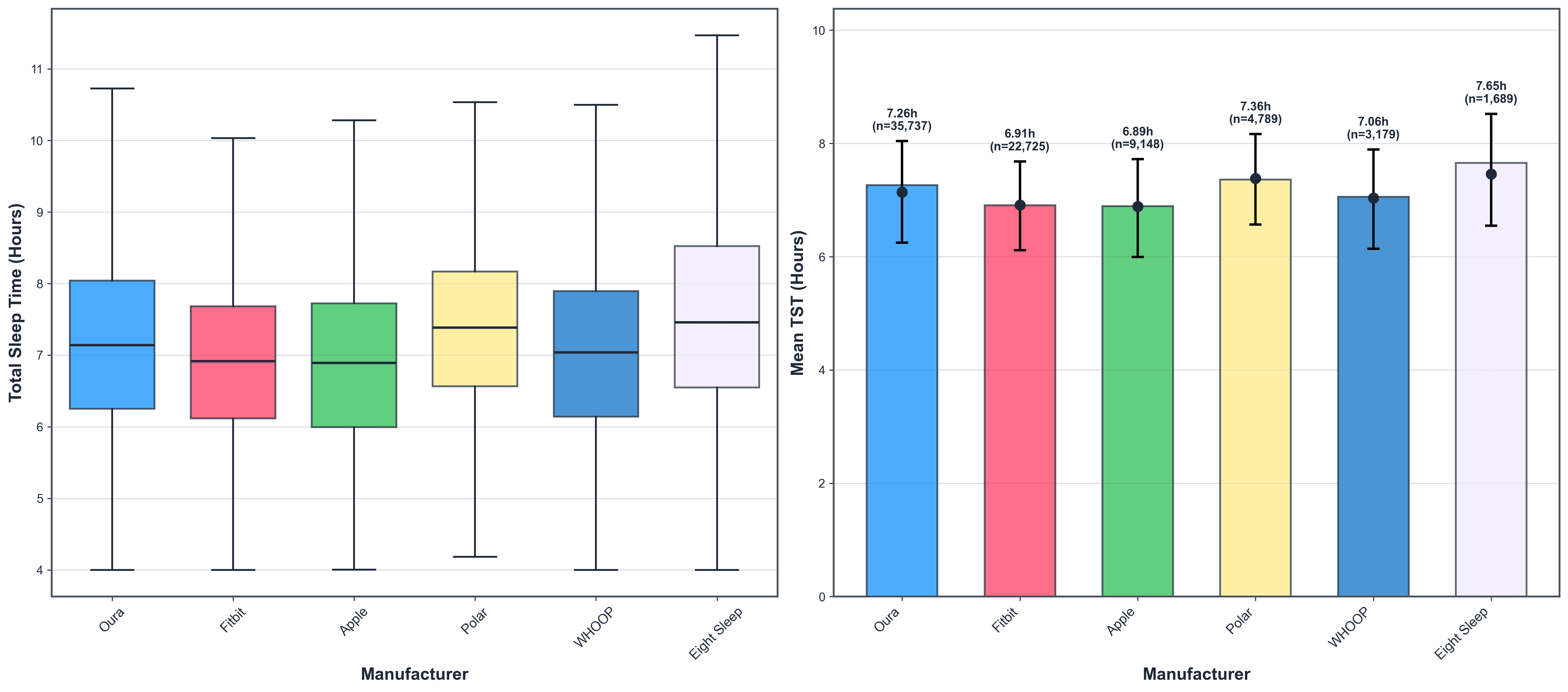
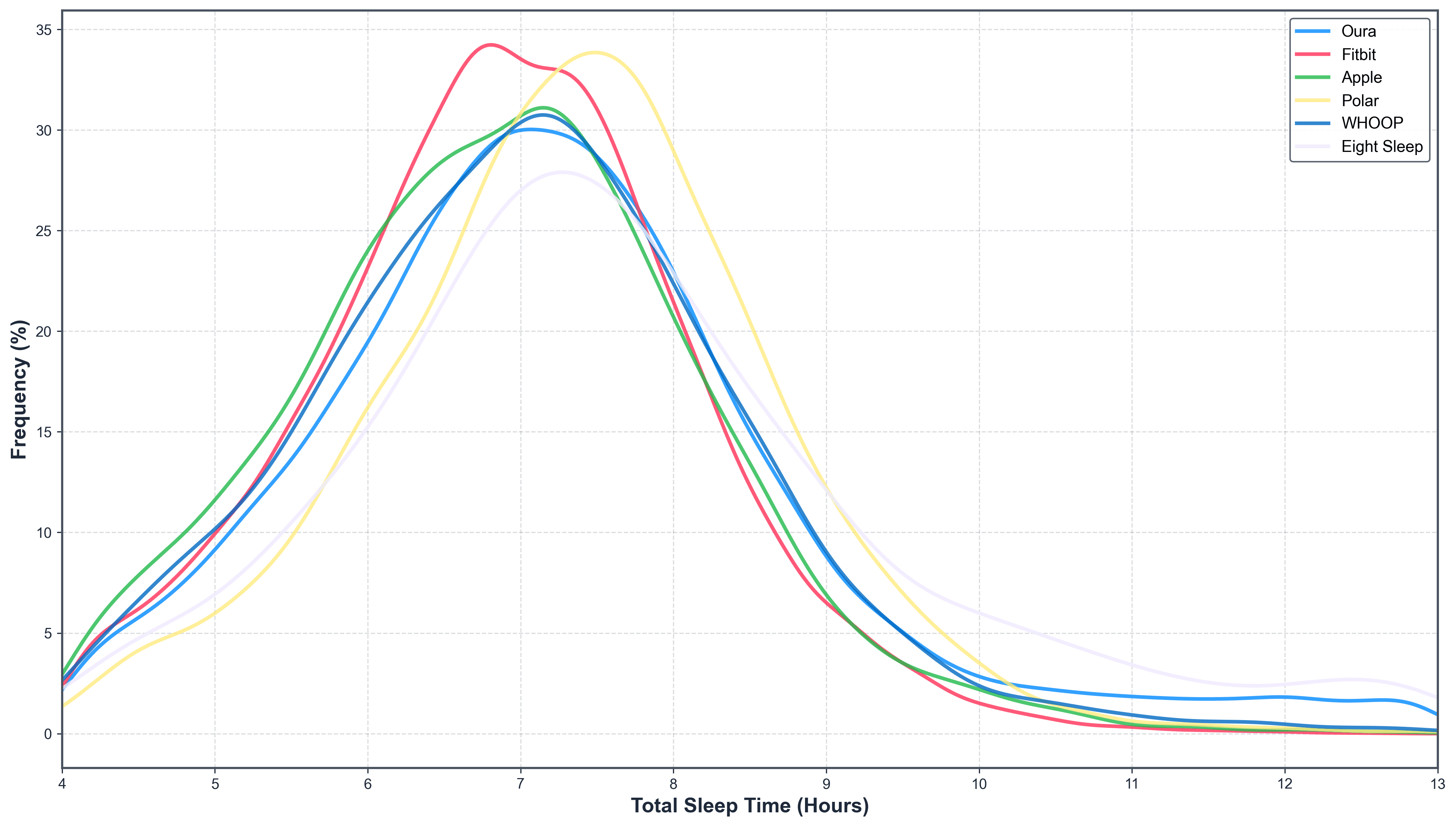
Population-Level Insights: A Solid ~7 Hours, With Notable Variations
Across the six manufacturers, mean total sleep time (TST) ranges from 6.89 to 7.65 hours—encouragingly close to the 7-9 hours recommended by sleep experts for cognitive health, immune function, and mood regulation. Wearable users, often more health-aware than the general population (where averages dip below 7 hours in many surveys), seem to prioritize sleep moderately well.
We’d expect this, as the sample is taken from a population that we can be confident are relatively (compared to the general population) interested in their health.
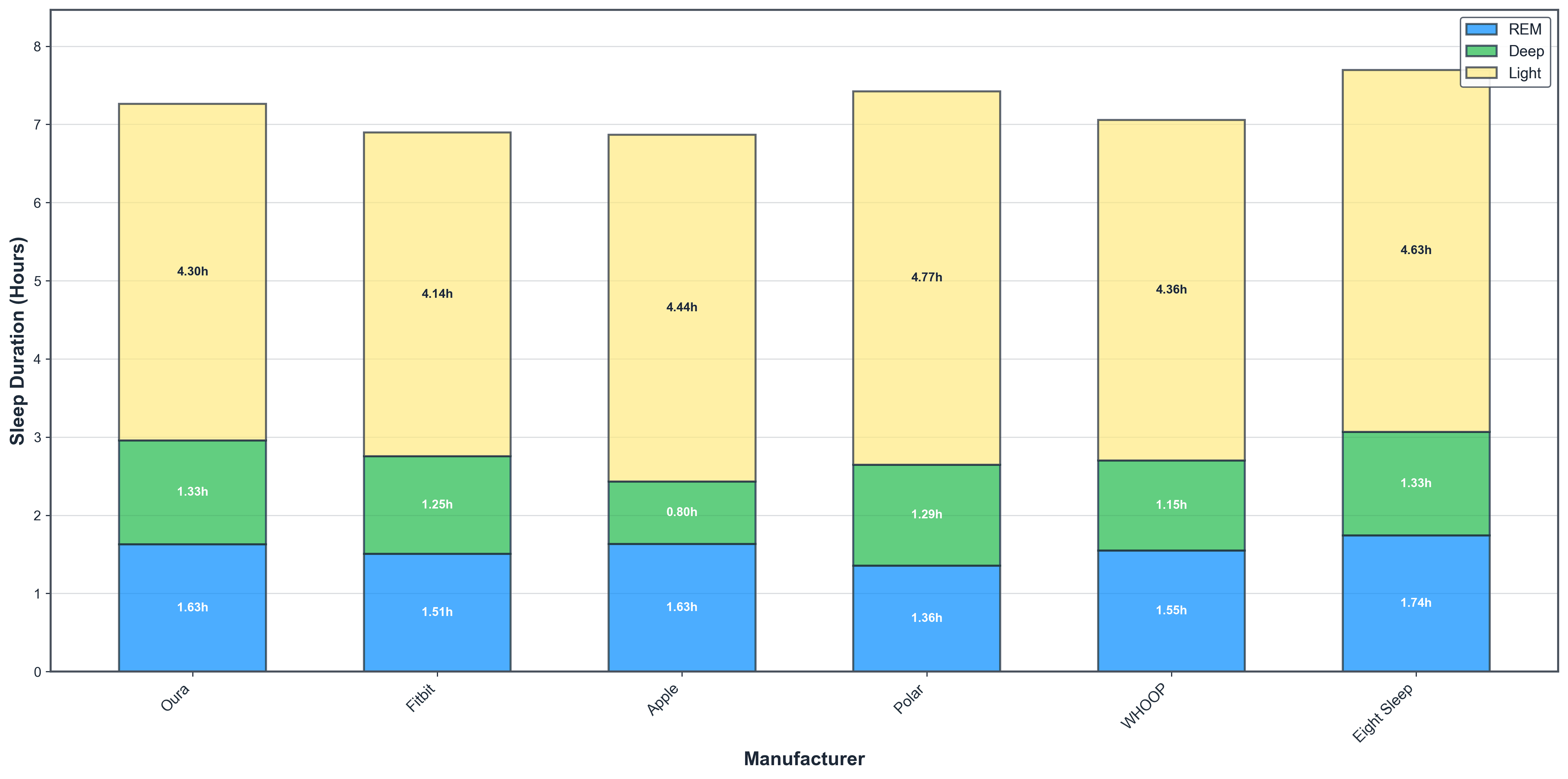
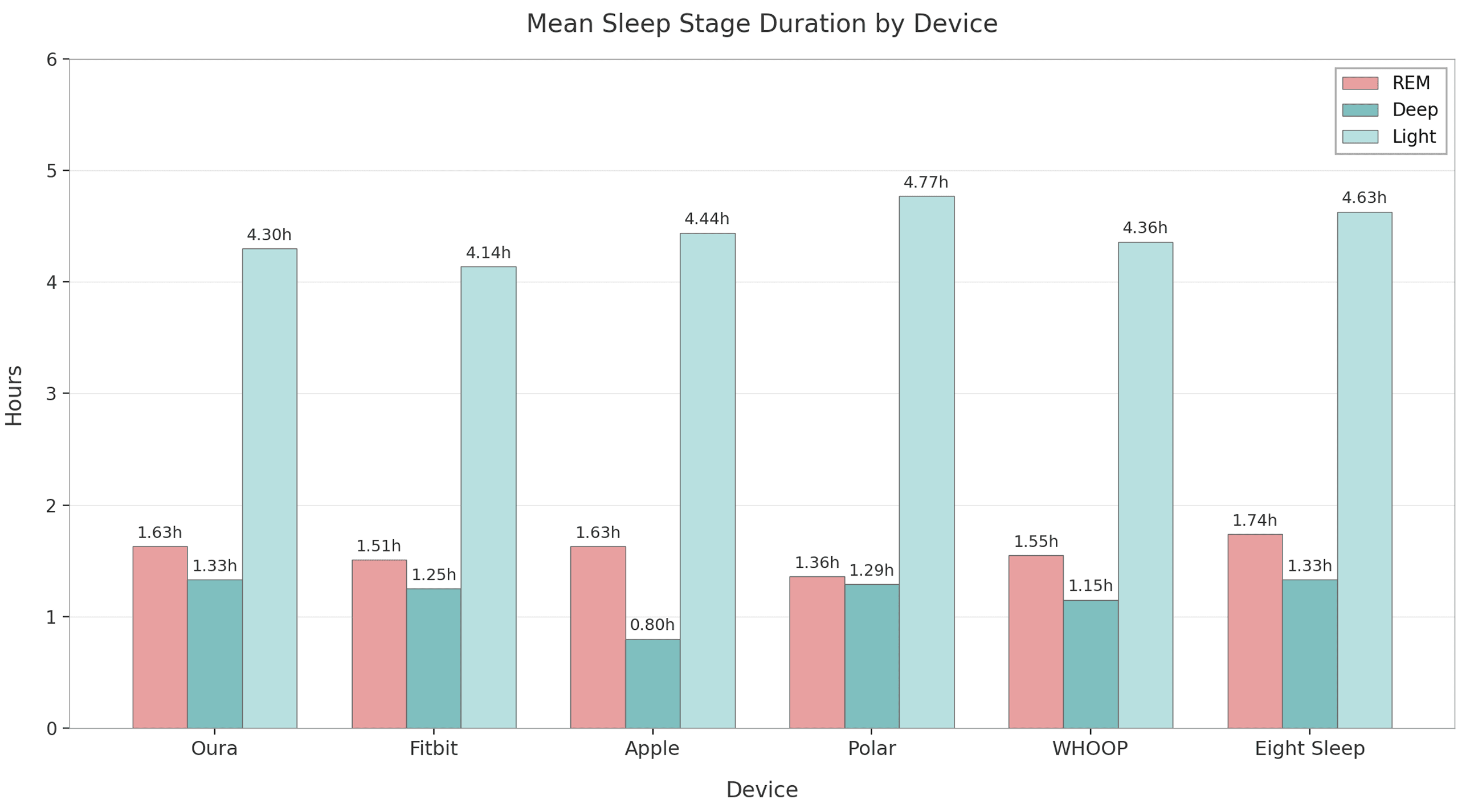
Sleep stages follow expected physiology: light dominates (~60%), REM ~20-25% (1.3-1.7 hours), and deep varies most (0.8-1.3 hours). Deep sleep's variability highlights a known challenge: consumer devices rely on heart rate, movement, and sometimes temperature, but struggle to match the EEG sensitivity of lab polysomnography for slow-wave detection.
Apple's low deep sleep aligns with peer-reviewed validation studies showing wrist-based actigraphy often underestimates slow-wave sleep compared to PSG [1][2].
WHOOP slots in comfortably, with averages reflecting its athlete-focused user base—decent duration but not outlier-long.
Direct Multi-Device Comparisons: Isolating Device Differences
Multi-device comparison is the true gold standard when we examine nights when the same individual uses multiple devices simultaneously: here, by perfectly controlling for the person, their physiology, bedtime habits, bedroom environment, and the exact sleep episode, we isolate pure device-to-device differences.
This direct, within-subject approach - rare in consumer tech analyses due to the need for real-world overlap data - offers unparalleled clarity on how algorithms interpret identical physiological signals, revealing genuine biases in total sleep time detection and stage classification that aggregated population data can only hint at.
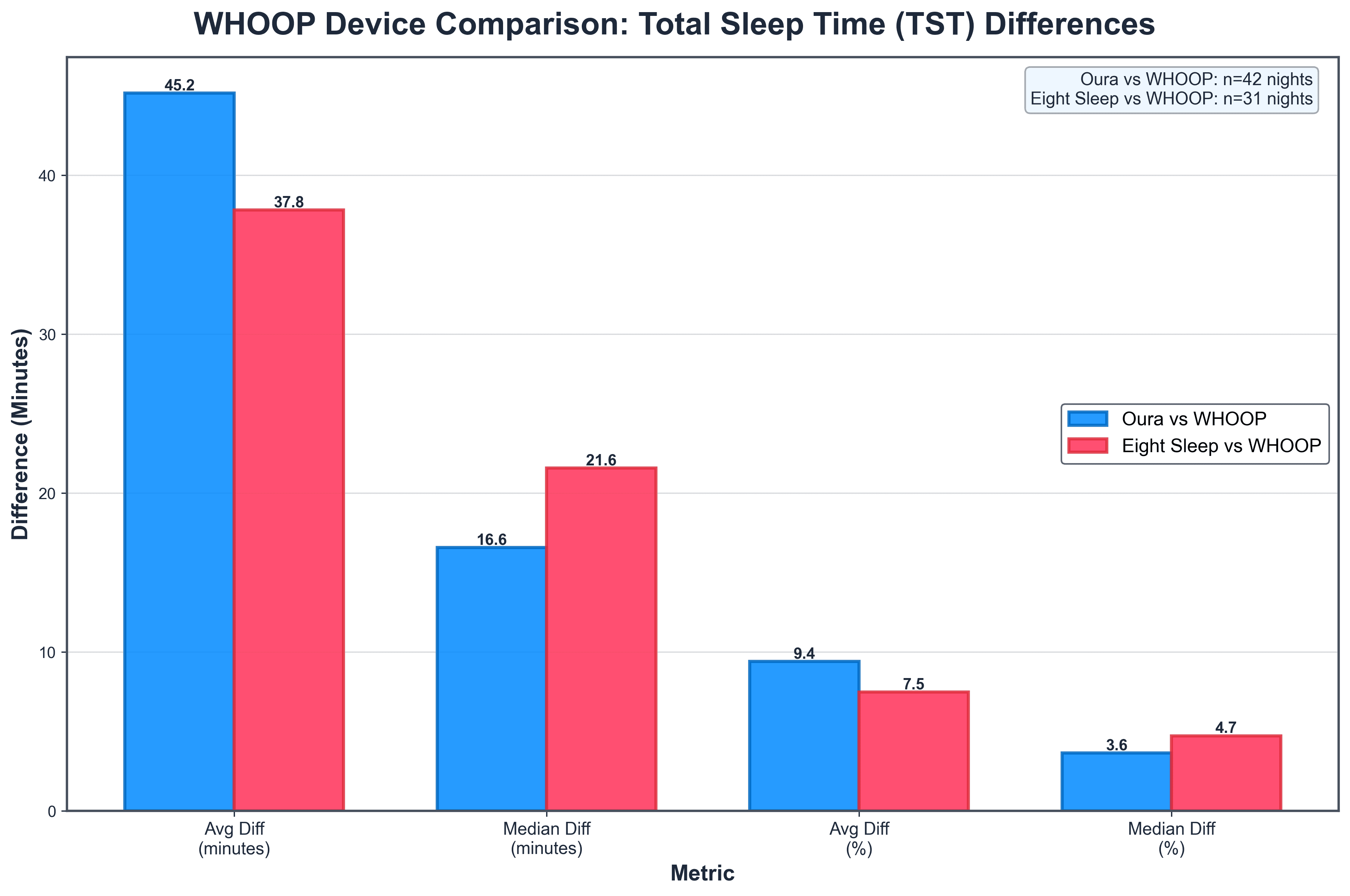
In the multi-device sleep tracker comparisons (such as Eight Sleep vs. WHOOP), the average total sleep time (TST) differences often appear substantially higher—around 38–45 minutes—compared to the much lower median differences of just 17–22 minutes. This discrepancy arises because the data is positively skewed: on most nights, the devices agree quite closely (differences under 20–30 minutes), pulling the median (the middle value when sorted) downward to reflect typical performance.
However, a smaller number of outlier nights—where one device significantly over- or under-estimates sleep due to factors like movement artefacts, poor sensor contact, or algorithmic edge cases—can produce large deviations (60+ minutes).
These extremes heavily inflate the average (mean), which is sensitive to outliers, while the median remains robust and more representative of what users experience on an average night. In sleep tracking research, this pattern is common, which is why medians are often preferred for assessing day-to-day reliability.
From 725 users contributing 2,144 overlapping nights (mostly dual-device), we gain clearer device insights into how devices compare. We only ran comparisons on pairs with 20+ nights of data:
- Oura vs. WHOOP (42 nights from multiple users):
- Median TST difference: 16.6 minutes (average 45.2 minutes)
- WHOOP higher TST on 57.1% of nights
- Per-user averages ranged 7.2–86.4 minutes difference; most showed night-to-night variability (71.4% mixed direction)
- Eight Sleep vs. WHOOP (31 nights):
- Median TST difference: 21.6 minutes (average 37.8 minutes)
- WHOOP higher on 80.6% of nights—a more consistent bias
- Some users (40%) always had WHOOP higher; others mixed
Direct comparisons between WHOOP and Oura (across 42 nights) and between WHOOP and Eight Sleep (31 nights) reveal deeper insights into device-specific biases and user variability in sleep tracking. Notably, WHOOP tends to report longer total sleep time (TST) more frequently—57% of nights against Oura and a striking 81% against Eight Sleep—suggesting WHOOP's strap-based algorithm may be more lenient in classifying quiet wakefulness as sleep, perhaps due to its focus on athlete recovery metrics. However, median TST differences remain modest (under 25 minutes), indicating strong overall agreement for most nights, while larger average differences highlight occasional outliers influenced by factors like fit or movement.
Sleep stage discrepancies are even more pronounced, with average gaps exceeding 250 minutes for light sleep, underscoring algorithmic divergences: Oura's ring sensors (incorporating temperature) appear to detect more nuanced transitions, while Eight Sleep's bed-based system emphasizes REM, potentially overestimating it relative to WHOOP. User-level patterns add nuance—71% of Oura-WHOOP users show mixed nightly biases, versus 40% of Eight Sleep-WHOOP users, where WHOOP consistently over reports—implying individual physiology or sleep position plays a role.
Broader Implications and Practical Advice
Combining both lenses: Population data shows tracker users sleeping ~7 hours with stage proportions broadly sensible, but direct comparisons reveal TST reliability within ~20 minutes across brands—reassuring for duration tracking—while stages remain interpretive.
For WHOOP fans: Your device performs comparably in aggregates and shows modest biases in direct matchups, often edging longer TST.
Ultimately, these tools motivate better habits and reveal patterns (e.g., weekend recovery). But discrepancies remind us to Focus on subjective refreshment rather than chasing identical scores. Avoid "orthosomnia"—stress from imperfect data!
References
[1] de Zambotti, Massimiliano, et al. “Wearable Sleep Technology in Clinical and Research Settings.” Medicine & Science in Sports & Exercise, 2019, https://pubmed.ncbi.nlm.nih.gov/30789439/.
[2] Walch, Olivia J., et al. “Sleep Stage Prediction with Raw Acceleration and Photoplethysmography Heart Rate Data Derived from a Consumer Wearable Device.” Sleep, vol. 42, no. 12, 2019, article zsz180, https://academic.oup.com/sleep/article/42/12/zsz180/5549536.
Summary
- How much do sleep trackers actually disagree on total sleep time?
- Less than you'd think for duration. Across 2,144 overlapping nights from 725 users, median total sleep time differences between devices stayed under 25 minutes — 16.6 minutes for Oura vs. WHOOP and 21.6 minutes for Eight Sleep vs. WHOOP. Averages look worse (38–45 minutes) but that's outlier nights pulling the mean; on a typical night, brands agree closely on how long you slept.
- Does WHOOP overestimate sleep compared to other wearables?
- It trends that way, especially against bed-based tracking. In direct head-to-head nights, WHOOP recorded longer total sleep time than Oura on 57.1% of nights and longer than Eight Sleep on 80.6% of nights. The Eight Sleep bias is the more consistent one — 40% of users had WHOOP always higher — suggesting WHOOP's strap algorithm may classify quiet wakefulness as sleep more readily.
- Why does my deep sleep number look so different on Apple Watch vs. other devices?
- Because deep sleep is the hardest stage for wrist-worn devices to detect. Across the six manufacturers analyzed, deep sleep ranged from roughly 0.8 to 1.3 hours per night, with Apple sitting notably low. This matches peer-reviewed validation work showing wrist actigraphy underestimates slow-wave sleep relative to lab polysomnography — consumer sensors simply can't match EEG sensitivity for slow-wave detection.
- Are wearable users actually sleeping enough?
- Mostly yes. Across more than 77,000 filtered main sleep episodes from six manufacturers, mean total sleep time landed between 6.89 and 7.65 hours — close to the 7–9 hour expert recommendation and notably better than general-population surveys that dip below 7 hours. The caveat: people who buy and consistently wear sleep trackers are a self-selected, health-aware group, so this isn't representative of the population at large.
- Can I trust the sleep stage breakdowns my wearable shows me?
- Trust the trends, not the exact minutes. In direct multi-device nights, average absolute differences for light sleep exceeded 250 minutes between devices on the same person on the same night — far larger than the ~20-minute disagreement on total sleep time. Oura's ring (with temperature) and Eight Sleep's bed sensors interpret transitions differently from WHOOP's strap, so stage numbers are best read as directional, not absolute.
- Why does Eight Sleep show longer sleep than wrist-based devices — is it the bed or the user?
- Probably both, and population data alone can't separate them. Eight Sleep led duration averages in the 6.89–7.65 hour range, but its users may self-select as more sleep-conscious biohackers. The direct comparison helps: on the same person, same night, WHOOP actually reported longer TST than Eight Sleep 80.6% of the time — so Eight Sleep's population-level lead is more about who buys it than the bed inflating numbers.
- Why do average and median sleep differences between devices look so different?
- Because device disagreement is positively skewed. Most nights, two devices land within 20–30 minutes of each other, but a small number of outlier nights — caused by movement artefacts, poor sensor contact, or algorithmic edge cases — can deviate 60+ minutes and drag the mean upward. That's why medians (16.6 min for Oura-WHOOP, 21.6 min for Eight Sleep-WHOOP) better represent the typical user experience than averages near 40 minutes.
- Should I worry about the differences between my devices' sleep scores?
- No — and chasing them can backfire. Duration tracking is reliable within ~20 minutes across brands, which is plenty of signal for spotting patterns like weekend recovery or chronic short sleep. Stage breakdowns are interpretive, so focus on how refreshed you feel rather than reconciling numbers between apps; stressing over imperfect data ('orthosomnia') is its own sleep problem.
Continue reading
Running
Data Shows Most Runners Don't Actually Get Faster
How do runners actually get faster? We analyzed 856,000 running activities to find out who actually gets faster. It wasn't the intense ones, but rather the consistent ones. Showing up month after month beat everything flashier. Boring, as it turns out, is fast.
May 7, 2026

Marathon Series
The Data Behind the London Marathon
While Sabastian Sawe was busy breaking the two-hour marathon barrier in London, the watches of 571 amateur runners told a quieter but equally fascinating story. GPS devices over-measured the course by 527 metres on average, faster runners ran with higher heart rates than the slower ones did, and Coros watches reported 47% more calories per kilometre than physiology actually supports.
April 27, 2026

London Data
Tube Strikes Made Londoners Active
During the April 2026 Tube strikes, Londoners adapted by cycling more—activity tripled, e-bike commutes rose 13%, and 19% of cyclists were entirely new to riding. Data analysis of 1,566 weekday rides revealed e-bike share jumped from 54.9% to 67.5%, with commutes often staying local. The strikes disrupted transit but highlighted Londoners' resilience in finding alternative ways to move.
April 24, 2026

Endurance Training
Running Is The Hardest Endurance Sport? Not so Fast
Which sport is hardest on the heart? We ran the question through hundreds of thousands of sessions across nine activity types. Running dominates minute-for-minute. It has the highest average, highest peak, highest sustained intensity. But its shorter sessions mean total cardiovascular load per outing often falls behind skiing or hiking. The shape of the heart rate curve tells a different story for every sport, and the weighting method you pick changes the answer.
April 23, 2026